There seems to be a lot of debates in the photo community about what is ‘the best’. One hot topic film photographers will talk about is which scanner is better: Frontier or Noritsu. We feel like there are no hard and fast rules about which scanner is better. It is about knowing which one best fits your aesthetic. In order to help you understand the differences between the scanners, we will be doing an on-going series to compare the Frontier and Noritsu. We will be showing how they react to pushed film, different lighting scenarios, and various film stocks. Today, we’ll look at the subtle color differences, and specifically contrast, between the two. To start, there are a few things to note about the two scanners.
FRONTIER:
- Strong emphasis in the yellow/blue channel
- Richer black point
- Punchier color
- Skin tones typically more golden
NORITSU:
- Strong emphasis in the magenta/green channel
- Light and airy (but can do dark and moody as well)
- Unparalleled highlight retention
- Skin tones typically more pink/peach
Keep in mind that neutral skin tones can be achieved on either scanner!
The Frontier has very limited options that a scanning technician can change. Overall, they can focus on changing the intensity of the shadows or highlights, but the Frontier doesn’t have as wide of a range as the Noritsu. The Noritsu has naturally lower contrast, but allows for much more customization in-scanner.
These images were shot on Portra 400 on an overcast day. Images shot when it is overcast tend to be higher in contrast. The light is really diffused, mainly affecting your highlights. Additionally, shadows in your scene can be muddy or darker. You can see in the example below how the Noritsu was able to produce varying contrast results. Because this image was high in contrast, the Frontier embraced that.
*Please note none of these examples have been modified in post production but your aesthetic can be further refined in post.
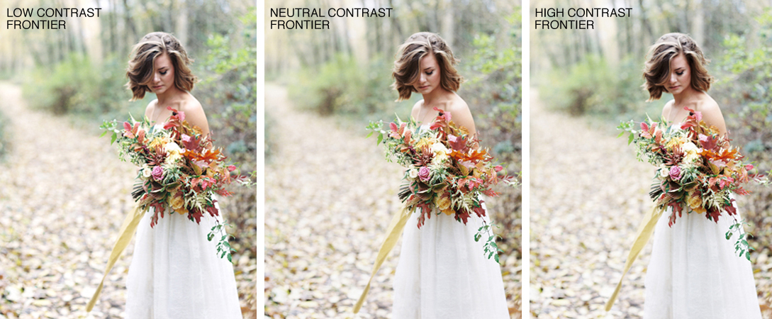
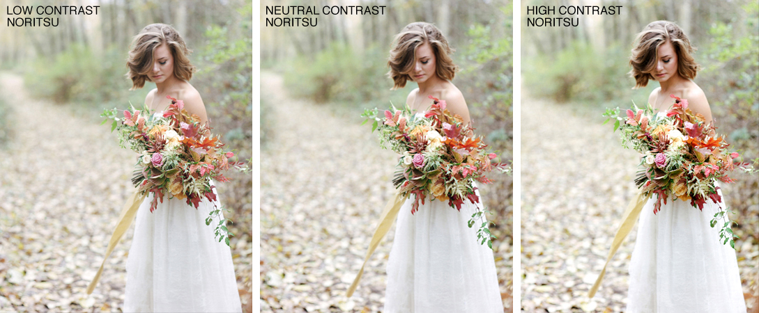
As you can see by these comparisons, the Noritsu has a lot more flexibility when it comes to providing both low and high contrast. Ultimately, there is not an easy answer to which scanner is ‘best’. It just depends on your preferred aesthetic, and which scanner will help you receive the best product in the end!
If you would like to see a comparison on your own work, feel free to write that in the notes section of the order form! There is no added turnaround time for this comparison, just a small charge for the scanning portion only.
photo by Marla Cyree | Portra 400 | Pentax 645
