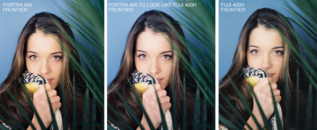
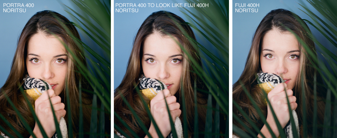
Because of the increased latitude of Portra 400, we’ve received many requests to scan and edit Portra 400 to look like Fuji 400H. Because of this, we want to let you in on a little secret! Our lab can make them look similar to save you a few extra bucks. We understand most people won’t be shooting these two film stocks back to back for comparison, but we wanted to show you how similar they can be.
The most important thing is to make sure we start in good, clean light. It is really difficult to adjust the tones in film when they are underexposed. Underexposure with these two film stocks leads to muddy shadows and an overall yellow image. While shooting for this blog post, we made sure all images were created in clean light and overexposed a stop and a half.
The second thing to understand is the base color of each film stock. A good way to think of this is like painting an image on a canvas. With film, our ‘canvas’ doesn’t start with a true white. When using Portra 400 its canvas has a yellow and slightly red base color. Fuji 400H has a cyan and green base color. One of the reasons people gravitate toward the aesthetic of Fuji 400H is for its neutral skin tones and unique coloring of foliage. Fuji 400H is best known for its cool greens while Portra 400 will typically have warm greens.
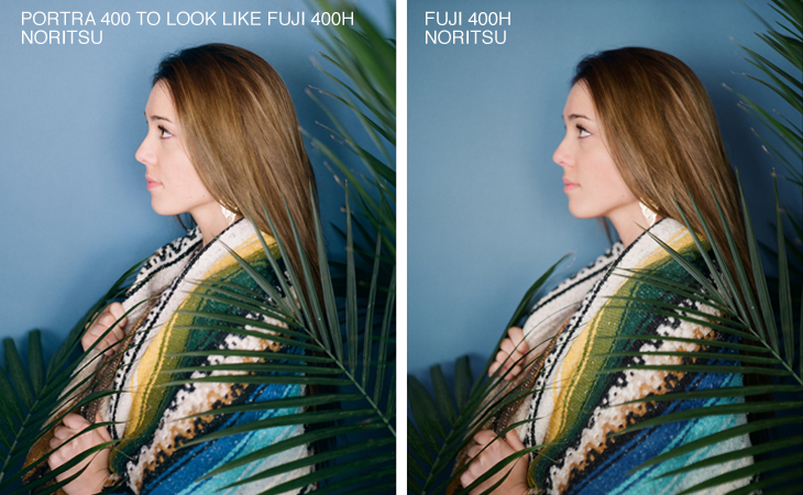
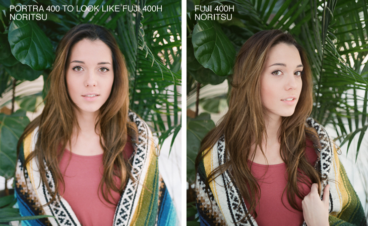
To achieve the Fuji 400H look, we recommend having film scanned on the Noritsu rather than the Frontier. The Noritsu primarily works in the magenta and green channel, so there is less yellow. Portra 400 naturally has a warmer base than 400H, so the tones in the image need to be cooled down overall in scanning. As you can see in the comparison images below, the Noritsu provided more control without going too cool.


Here are a few more comparison images from the Noritsu.


If you want to recreate this look, please make sure you include this in the notes section of your order form or feel free to give us a call!
photos by theFINDlab Team Members | Portra 400 and Fuji 400H | Mamiya 645